Note
This tutorial was generated from a Jupyter notebook that can be downloaded here. If you’d like to reproduce the results in the notebook, or make changes to the code, we recommend downloading this notebook and running it with Jupyter as certain cells (mostly those that change plot styles) are excluded from the tutorials.
Visualisation
In this tutorial, we explore how to use the various functions in the visualisation module of LEGWORK. The visualisation module is designed to make it quick and easy to plot various distributions of a collection of gravitational wave sources as well as show them on the LISA sensitivity curve.
Setup
First we need to import legwork and some other standard stuff.
[3]:
import legwork.visualisation as vis
from legwork import source, psd

import numpy as np
import astropy.units as u
import astropy.constants as const
import matplotlib.pyplot as plt
from matplotlib.colors import TwoSlopeNorm
Plotting parameter distributions
To start, we can explore how we can use the module to investigate distributions of parameters.
1D distributions
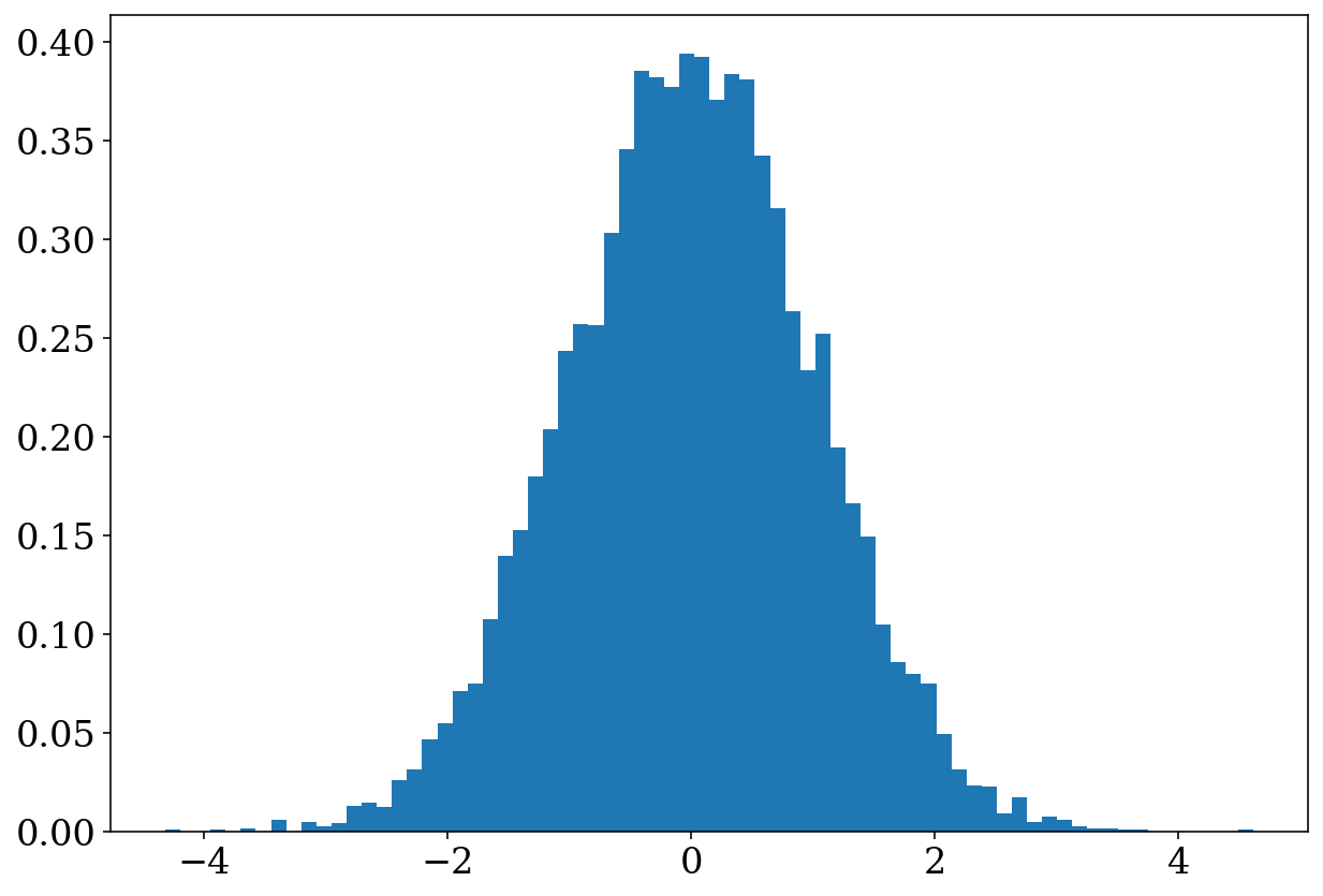
The first function we can take a look at is legwork.visualisation.plot_1D_dist(), which is essentially a wrapper over matplotlib.pyplot.hist(), seaborn.kdeplot() and seaborn.ecdfplot() such that you can dynamically switch between these types of distributions with a single function call. At its most basic level, you can use the function to examine a histogram of some distribution.
[5]:
# create a random normal variable
x = np.random.normal(size=10000)
[6]:
# plot with all of the default settings
fig, ax = vis.plot_1D_dist(x=x)
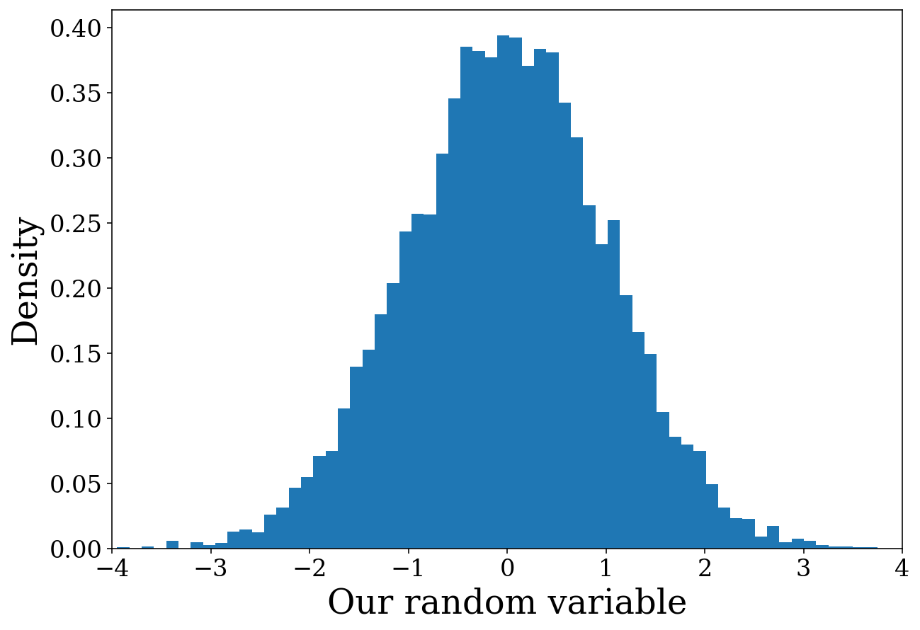
Nice and simple! But this plot isn’t particularly informative so we can also specify various plot parameters as part of the function. Let’s add some axis labels and change the x limits to ensure symmetry.
[7]:
fig, ax = vis.plot_1D_dist(x=x, xlabel="Our random variable", ylabel="Density", xlim=(-4, 4))
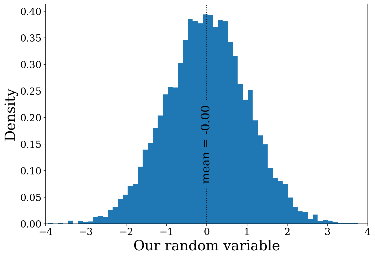
Well that’s much better! Perhaps instead of immediately showing the plot, it could be good to add some other features first. We can do this by specifying show=False and then using the returned figure and axis. Let’s put this into practice by adding a line indicating the mean of the distribution which should be approximately 0.
[8]:
# create the histogram but don't show it
fig, ax = vis.plot_1D_dist(x=x, xlabel="Our random variable", ylabel="Density",
                           xlim=(-4, 4), show=False)

# add a line and annotation
ax.axvline(np.mean(x), linestyle="dotted", color="black")
ax.annotate("mean = {0:1.2f}".format(x.mean()), xy=(np.mean(x), 0.15),
            rotation=90, ha="center", va="center", fontsize=20,
            bbox=dict(boxstyle="round", fc="tab:blue", ec="none"))

# show the figure
plt.show()
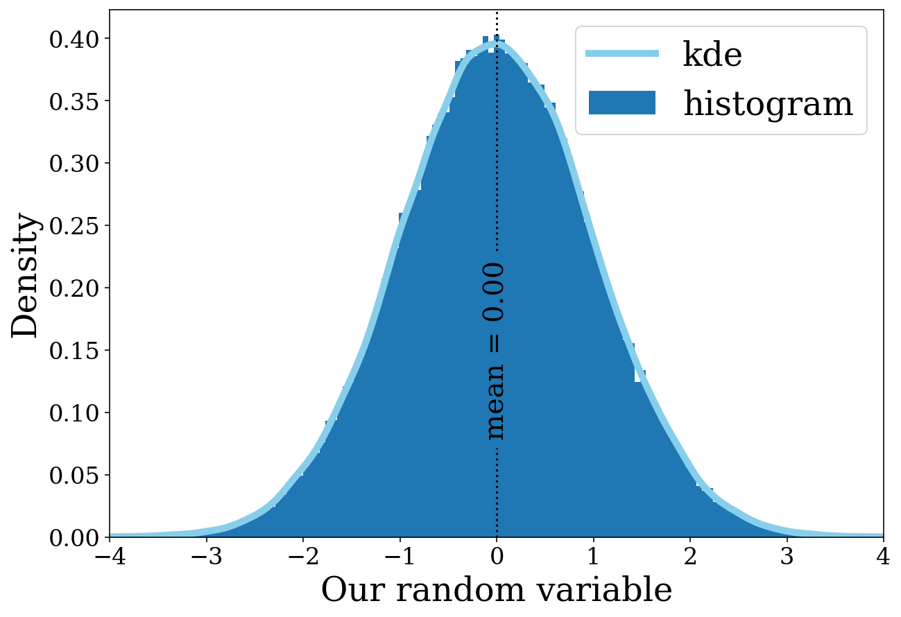
The histogram seems to be working nicely. However, that might not be the only way you want to show the distribution. From here we can explore how we can change the distribution with various arguments. Let’s add a KDE (kernel density estimator) in addition to the histogram.
[9]:
# create a larger sample for a smoother line
x = np.random.normal(size=100000)

# add the KDE
fig, ax = vis.plot_1D_dist(x=x, disttype="kde", show=False, color="skyblue", label="kde", linewidth=5)
fig, ax = vis.plot_1D_dist(x=x, xlabel="Our random variable", ylabel="Density", xlim=(-4, 4),
                           label="histogram", fig=fig, ax=ax, show=False)

# add a line and annotation
ax.axvline(np.mean(x), linestyle="dotted", color="black")
ax.annotate("mean = {0:1.2f}".format(x.mean()), xy=(np.mean(x), 0.15), rotation=90, ha="center", va="center",
            fontsize=20, bbox=dict(boxstyle="round", fc="tab:blue", ec="none"))

ax.legend()

# show the figure
plt.show()
More things you can try out
There’s only so much we can show in a tutorial but this function can do much more. Here are some things you may like to try out.
Explore the different disttypes, you can make an empirical cumulative distribution function with
disttype=ecdf.Try changing the number of bins in the histogram (
bins=10) or adjusting the bandwidth for the kde (bw_adjust=0.5)Plot things on a log scale with (
log=Truefor histograms orlog_scale=(True, False)for KDE/ECDFs)
2D distributions
This is very similar to the previous section except now you can make 2D distributions of either scatter plots or density distributions (since legwork.visualisation.plot_2D_dist() is a wrapper over matplotlib.pyplot.scatter() and seaborn.kdeplot()). Let’s make a simple scatter plot first.
[10]:
# create two random normal variables
n_vals = 10000
x = np.random.normal(size=n_vals)
y = np.random.normal(size=n_vals)
[11]:
# create a square figure
fig, ax = plt.subplots(figsize=(10, 10))

# add the scatter plot
fig, ax = vis.plot_2D_dist(x=x, y=y, fig=fig, ax=ax)
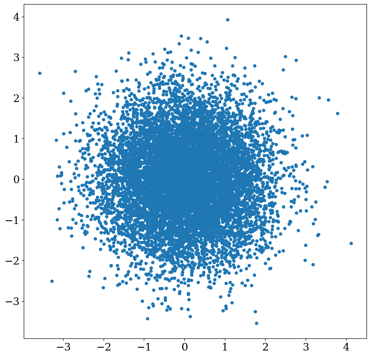
Again, we can make this much better by adding axis labels. But additionally the centre is rather oversaturated with points so it is hard to discern the distribution so let’s try decreasing the point size too (to scatter_s=0.5).
[12]:
# create a square figure
fig, ax = plt.subplots(figsize=(10, 10))

# add the scatter plot
fig, ax = vis.plot_2D_dist(x=x, y=y, fig=fig, ax=ax, xlim=(-4.5, 4.5), ylim=(-4.5, 4.5),
                           xlabel="A random normal variable", ylabel="Another random normal variable", scatter_s=0.5)
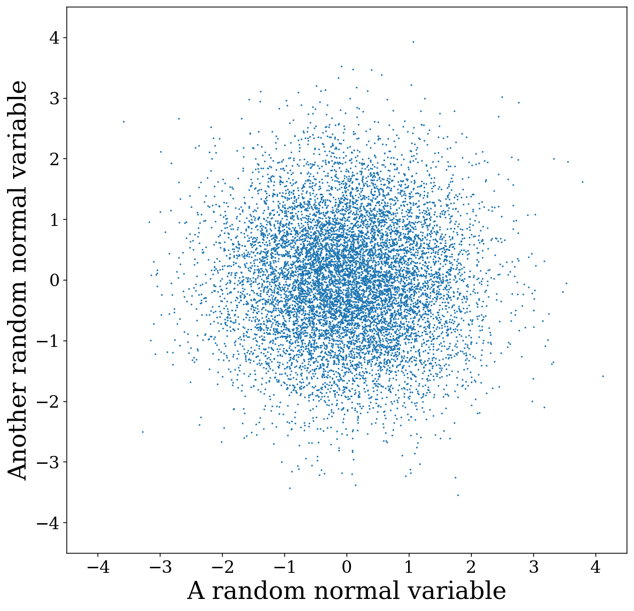
Well perhaps the centre is better…but now it is difficult to see the outliers! This is where the KDE density plot could really come in handy. So we can switch to disttype=kde instead.
[13]:
# create a square figure
fig, ax = plt.subplots(figsize=(10, 10))

# add the scatter plot
fig, ax = vis.plot_2D_dist(x=x, y=y, fig=fig, ax=ax, disttype="kde", fill=True, xlim=(-4.5, 4.5), ylim=(-4.5, 4.5),
                           xlabel="A random normal variable", ylabel="Another random normal variable")
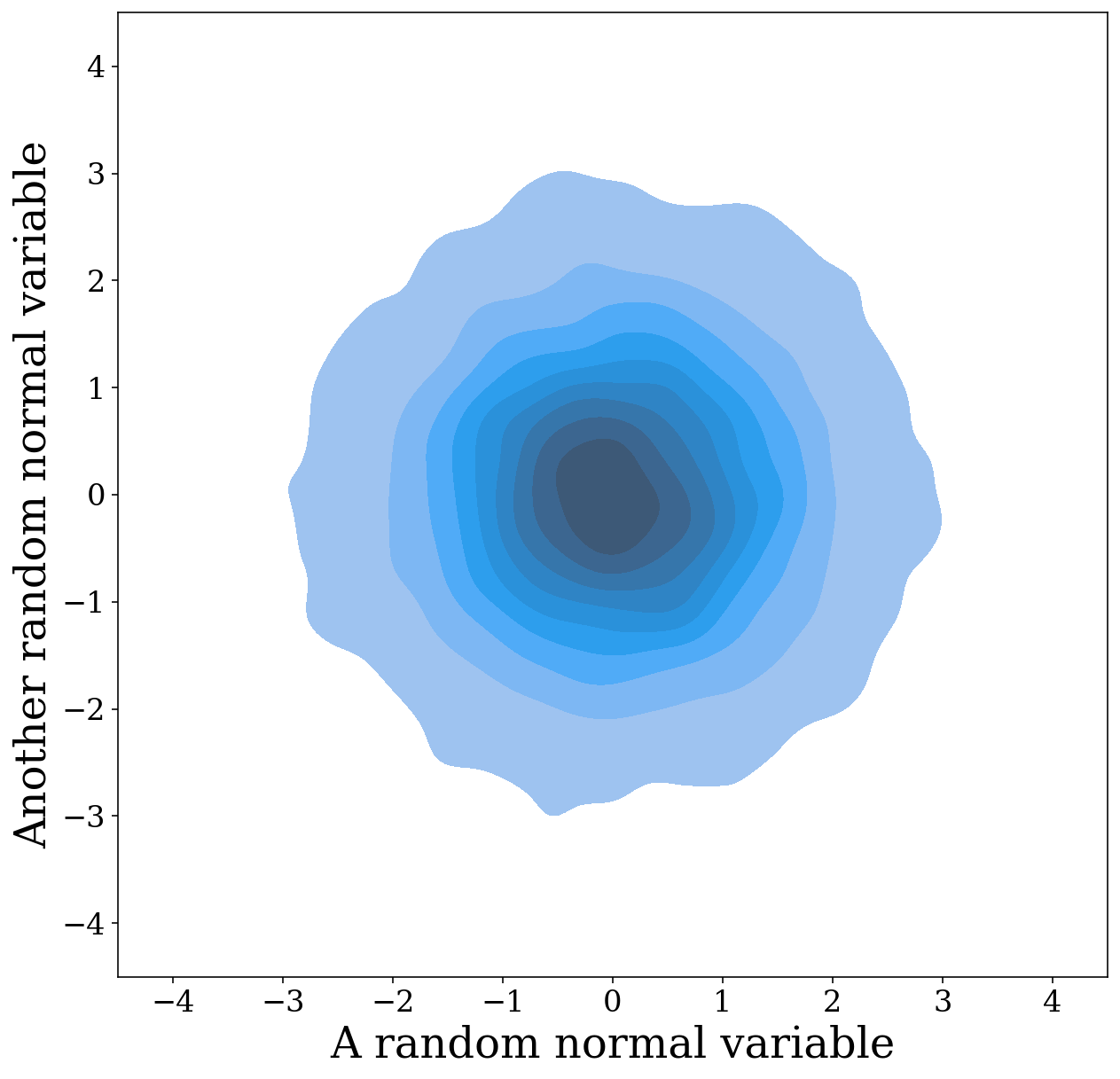
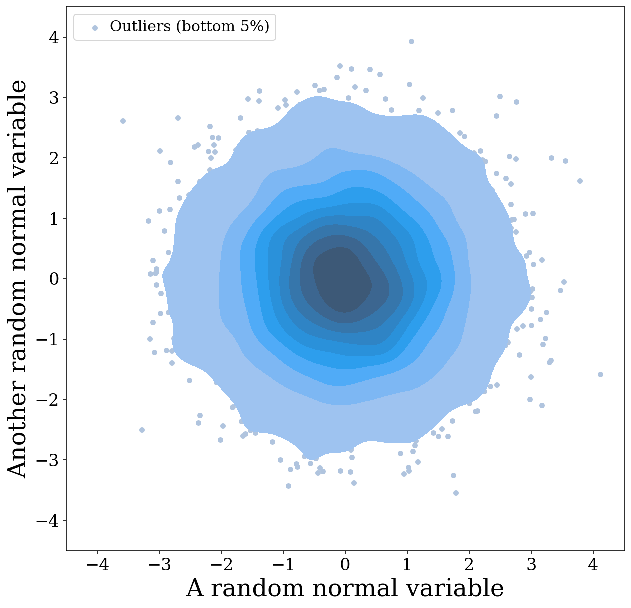
Well that looks rather cool! However, we’ve added another issue…now we can’t see any of the outliers as this density plot only goes down to the last 5% (you can adjust this with thresh=0.01 for example)! So why don’t we also add the scatter plot so the outliers are still present.
[14]:
# create a square figure
fig, ax = plt.subplots(figsize=(10, 10))

fig, ax = vis.plot_2D_dist(x=x, y=y, fig=fig, ax=ax, show=False, label="Outliers (bottom 5%)", color="lightsteelblue")
fig, ax = vis.plot_2D_dist(x=x, y=y, fig=fig, ax=ax, disttype="kde", fill=True, xlim=(-4.5, 4.5), ylim=(-4.5, 4.5),
                           show=False, xlabel="A random normal variable", ylabel="Another random normal variable")

# add legend with information on outliers
ax.legend(loc="upper left", handletextpad=0.0, fontsize=15)
plt.show()
Plotting distributions directly from the Source class
You may be thinking that all of those various options are rather a lot of work and perhaps you’d rather just immediately see the distribution of interesting source parameters. Have no fear, here is also a wrapper to help automatically plot and generate axis labels for plots of source parameters! For example, we can plot the chirp mass distribution like so:
[15]:
# create a random collection of sources
n_values = 1000
m_1 = np.random.uniform(0, 10, n_values) * u.Msun
m_2 = np.random.uniform(0, 10, n_values) * u.Msun
dist = np.random.uniform(0, 30, n_values) * u.kpc
f_orb = 10**(np.random.uniform(-5, -2, n_values)) * u.Hz
ecc = np.random.uniform(0.0, 0.2, n_values)

sources = source.Source(m_1=m_1, m_2=m_2, ecc=ecc, dist=dist, f_orb=f_orb, interpolate_g=False)
[16]:
# create a histogram of the chirp mass
fig, ax = sources.plot_source_variables(xstr="m_c")
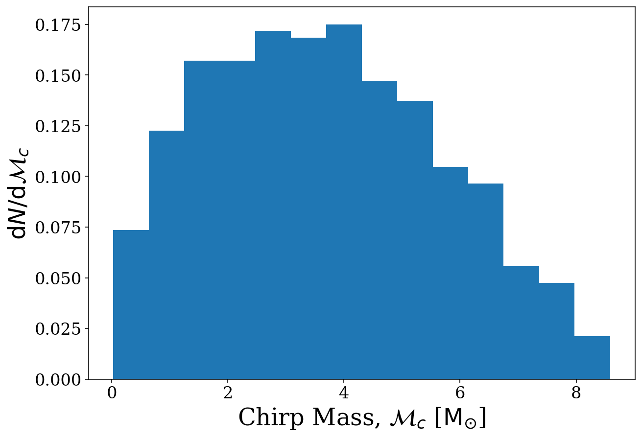
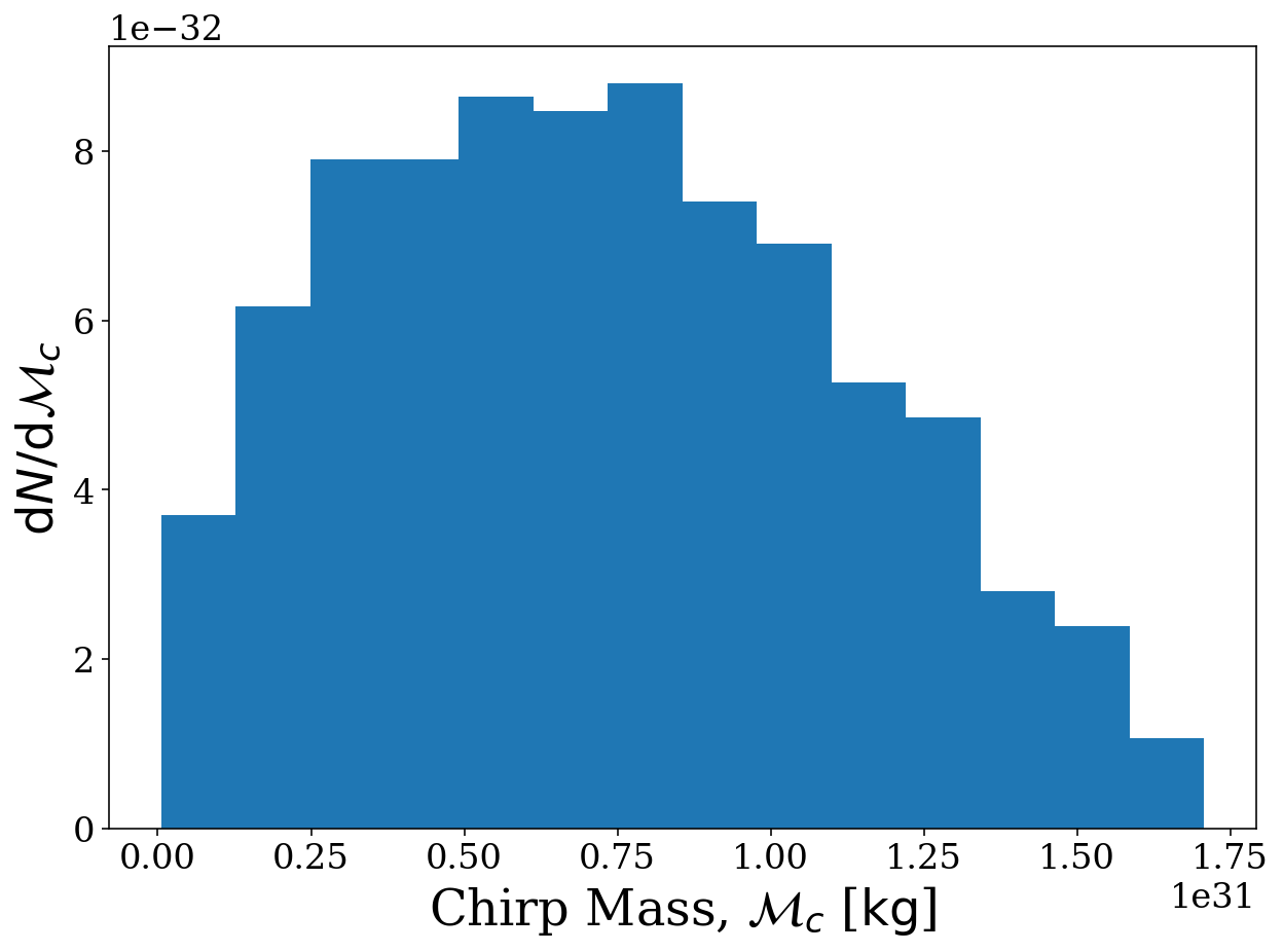
We could have done this for any of the variables, see the documentation legwork.source.Source.plot_source_variables() for a full list of parameters you can plot. Also, note that the axis labels are auto-generated based on the units of the variable. For example, let’s change the unit of the chirp mass to see how it changes the axis labels.
[17]:
# convert chirp mass to kilograms using astropy.units
sources.m_c = sources.m_c.to(u.kg)

# plot the chirp mass using exactly the same code as before
fig, ax = sources.plot_source_variables(xstr="m_c")
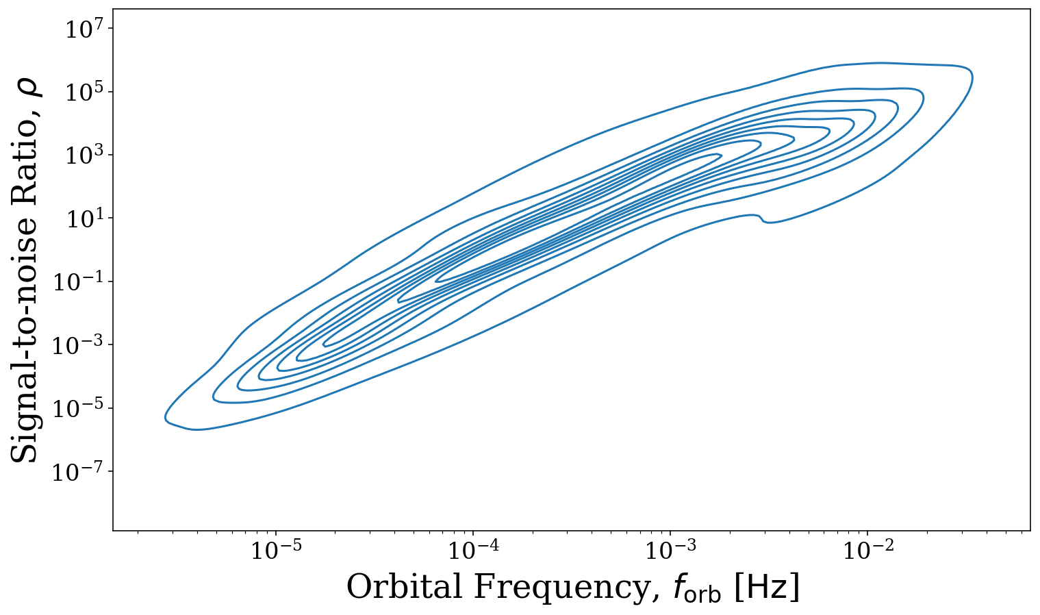
You can also supply two variables and get a 2D distribution instead. Let’s compare the orbital frequency and signal-to-noise ratio (which we need to compute first!)
[18]:
# compute the SNR (verbosely so you can see what types of sources we have)
snr = sources.get_snr(verbose=True)
Calculating SNR for 1000 sources
        0 sources have already merged
        959 sources are stationary
                306 sources are stationary and circular
                653 sources are stationary and eccentric
        41 sources are evolving
                15 sources are evolving and circular
                26 sources are evolving and eccentric
[19]:
fig, ax = sources.plot_source_variables(xstr="f_orb", ystr="snr", disttype="kde", log_scale=(True, True))
Weighted Samples
What if you prefer one source over the other?? LEGWORK handles this too! Just set the weights in the source and they’ll be used in all histograms and KDEs and scatter plots will have different point sizes
[20]:
weights = np.random.uniform(0, 10, n_values)
sources.weights = weights
[21]:
sources.plot_source_variables(xstr="m_1", ystr="m_2")
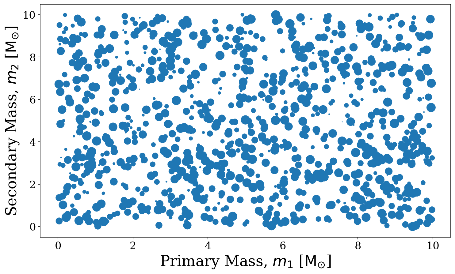
[21]:
(<Figure size 1200x700 with 1 Axes>,
 <Axes: xlabel='Primary Mass, $m_1$ [$\\mathrm{M_{\\odot}}$]', ylabel='Secondary Mass, $m_2$ [$\\mathrm{M_{\\odot}}$]'>)
Plot sensitivity curves
LISA curve
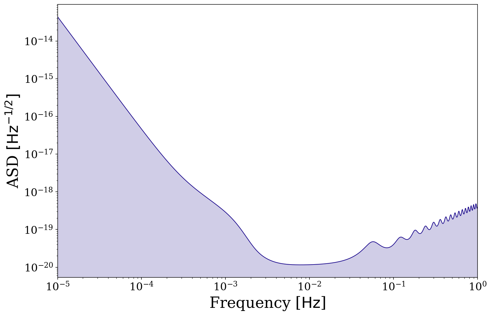
We also add functionality to plot the LISA sensitivity curve. Creating a basic sensitivity curve is as simple as follows. By default it will plot between \(10^{-5} < f /\, \rm{Hz} < 1\), with a purple line (the purple matches well with the matplotlib matplotlib.pyplot.plasma() colormap) and transparent shading below.
[22]:
fig, ax = vis.plot_sensitivity_curve()
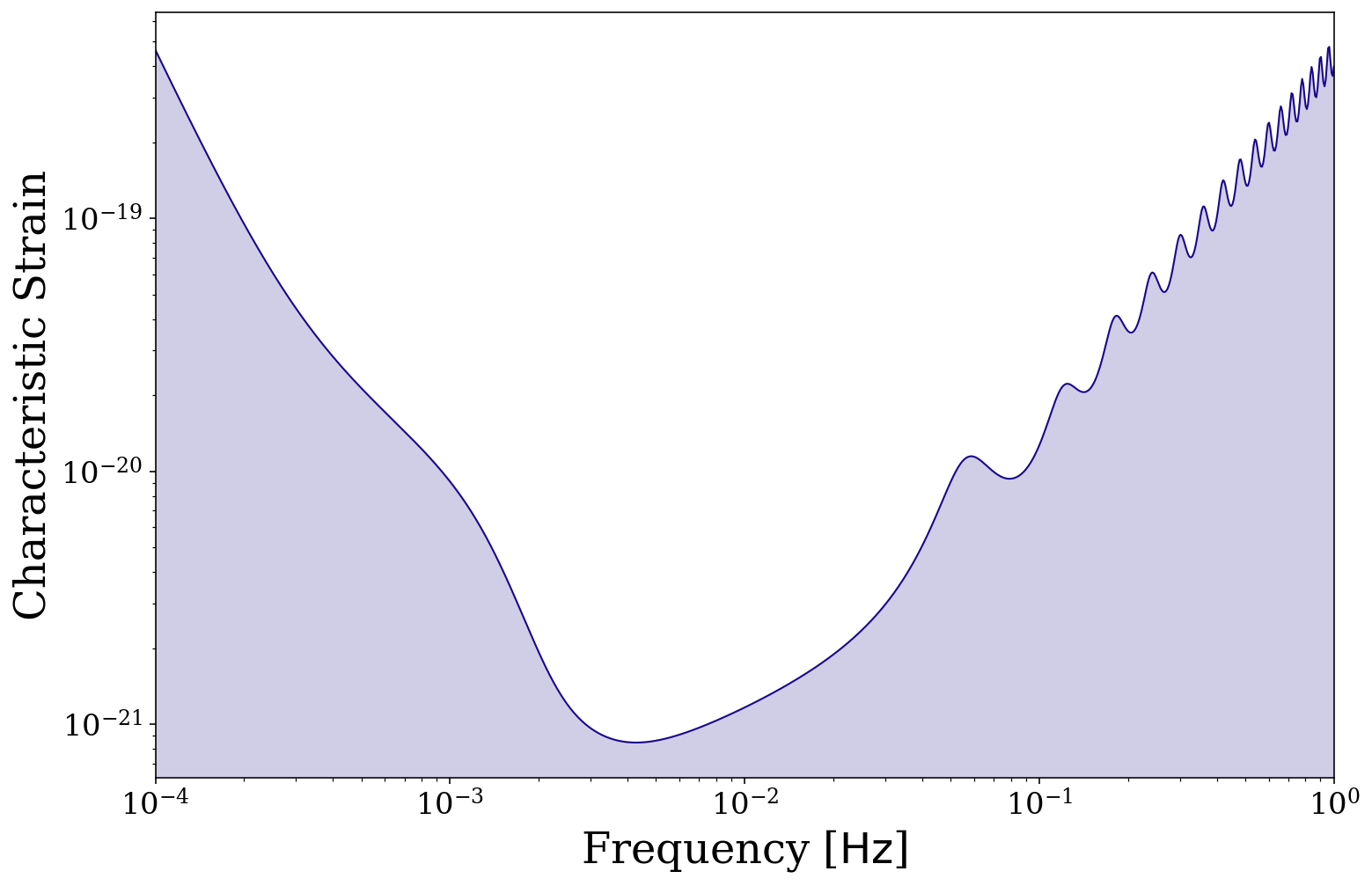
For the default sensitivity curve we plot the ASD, \(\sqrt{S_{\rm n}(f)}\), but it is also possible to plot the characteristic strain, \(\sqrt{f S_{\rm n}(f)}\), instead. As a demonstration, let’s also adjust the frequency range to ignore low frequencies.
[23]:
frequency_range = np.logspace(-4, 0, 1000) * u.Hz
fig, ax = vis.plot_sensitivity_curve(frequency_range=frequency_range, y_quantity="h_c")
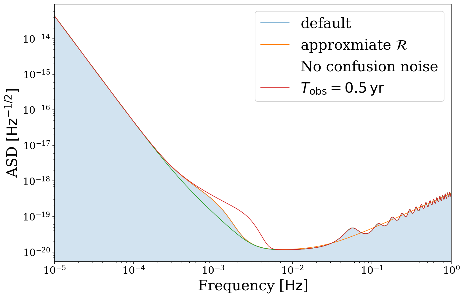
It is also possible to adjust the sensitivity curve by changing the mission length, transfer function approximation and confusion noise. For this plot we set the color=None so that it picks default matplotlib colours and remove the fill for clarity.
[24]:
# default settings (keep fill for this one)
fig, ax = vis.plot_sensitivity_curve(label="default", fill=True, show=False, color=None)

# approximate the LISA transfer function
fig, ax = vis.plot_sensitivity_curve(approximate_R=True, color=None, label=r"approxmiate $\mathcal{R}$",
                                     fill=False, fig=fig, ax=ax, show=False)

# remove all confusion noise
fig, ax = vis.plot_sensitivity_curve(confusion_noise=None, color=None,label=r"No confusion noise",
                                     fill=False, fig=fig, ax=ax, show=False)

# shorten the mission length (increases confusion noise)
fig, ax = vis.plot_sensitivity_curve(t_obs=0.5 * u.yr, color=None, label=r"$T_{\rm obs} = 0.5 \,\rm{yr}$",
                                     fill=False, fig=fig, ax=ax, show=False)

ax.legend()

plt.show()
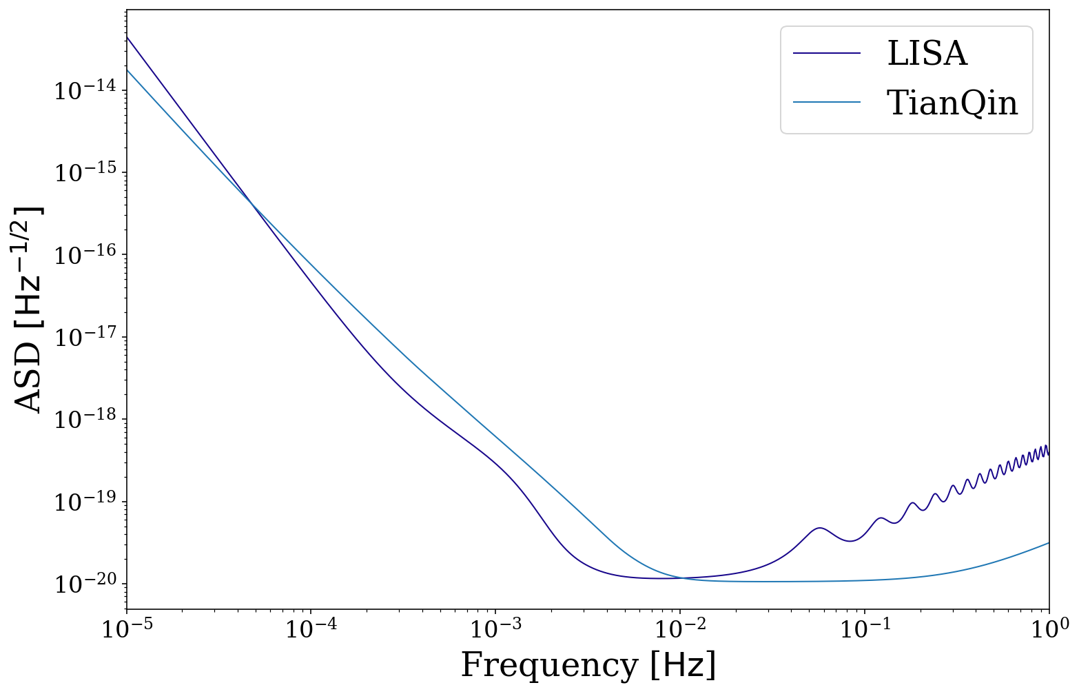
Alternate instruments
We also support the use of other sensitivity curves. Currently we have implemented the TianQin curve by default but also allow custom curves.
[25]:
# compare LISA and TianQin
fig, ax = vis.plot_sensitivity_curve(show=False, fill=False, instrument="LISA", label="LISA")
fig, ax = vis.plot_sensitivity_curve(show=False, fill=False, instrument="TianQin", label="TianQin",
                                     color=None, fig=fig, ax=ax)
ax.legend()
plt.show()
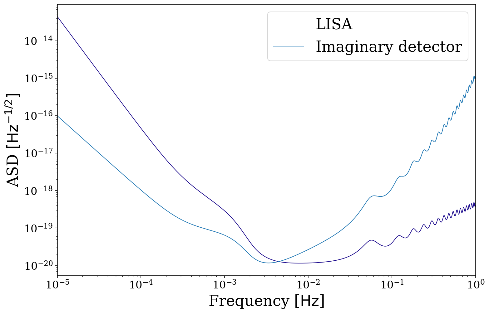
Let’s also compare LISA with some imaginary detector that is a factor different than LISA
[26]:
# compare LISA to an imaginary detector
fig, ax = vis.plot_sensitivity_curve(show=False, fill=False, instrument="LISA", label="LISA")

# note function signature must be the same as lisa_psd, despite some values being ignored
def imaginary_detector(f, t_obs, L, approximate_R, confusion_noise):
    return 5e4 * f.value**2 * np.exp(5 * f.value) * psd.lisa_psd(f=f)

fig, ax = vis.plot_sensitivity_curve(show=False, fill=False, instrument="custom",
                                     custom_psd=imaginary_detector, label="Imaginary detector",
                                     color=None, fig=fig, ax=ax, L=5e9)
ax.legend()
plt.show()
Plot sources on the sensitivity curve
Finally, we can combine everything we’ve done so far in this tutorial in order to plot distributions of binaries on the sensitivity curve.
Note
We currently only support this for stationary sources (that are plotted as points rather than lines) but we are working on implementing this for evolving sources too.
Circular and Stationary Binaries
Let’s start by creating a collection of circular and stationary binaries and computing the SNR for each.
[27]:
n_values = 500
m_1 = np.random.uniform(0, 10, n_values) * u.Msun
m_2 = np.random.uniform(0, 10, n_values) * u.Msun
dist = np.random.uniform(0, 30, n_values) * u.kpc
f_orb = 10**(np.random.uniform(-5, -3, n_values)) * u.Hz
ecc = np.repeat(0.0, n_values)
t_obs = 4 * u.yr
weights = np.random.uniform(0, 1, n_values)

sources = source.Source(m_1=m_1, m_2=m_2, ecc=ecc, dist=dist, f_orb=f_orb, weights=weights,
                        interpolate_g=False)
[28]:
circ_stat_snr = sources.get_snr(verbose=True)
Calculating SNR for 500 sources
        0 sources have already merged
        500 sources are stationary
                500 sources are stationary and circular
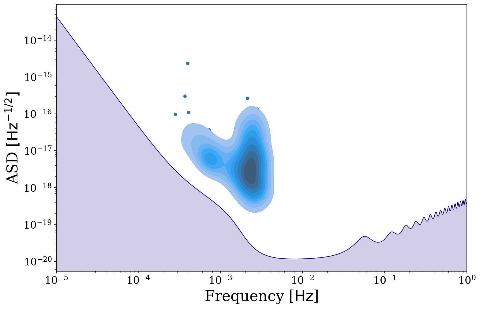
Now we can plot these binaries on the sensitivity curve using legwork.source.Source.plot_sources_on_sc(). Here we only plot those with SNR > 7 and, as earlier, we plot a density distribution for the most common 90% of the distribution and plot the remaining 10% outliers as scatter points. Try changing the value of thresh or switching whether to fill the KDE.
[29]:
fig, ax = sources.plot_sources_on_sc(snr_cutoff=7, show=False)
fig, ax = sources.plot_sources_on_sc(snr_cutoff=7, disttype="kde", color="tab:blue", thresh=0.1, fill=True, fig=fig, ax=ax)
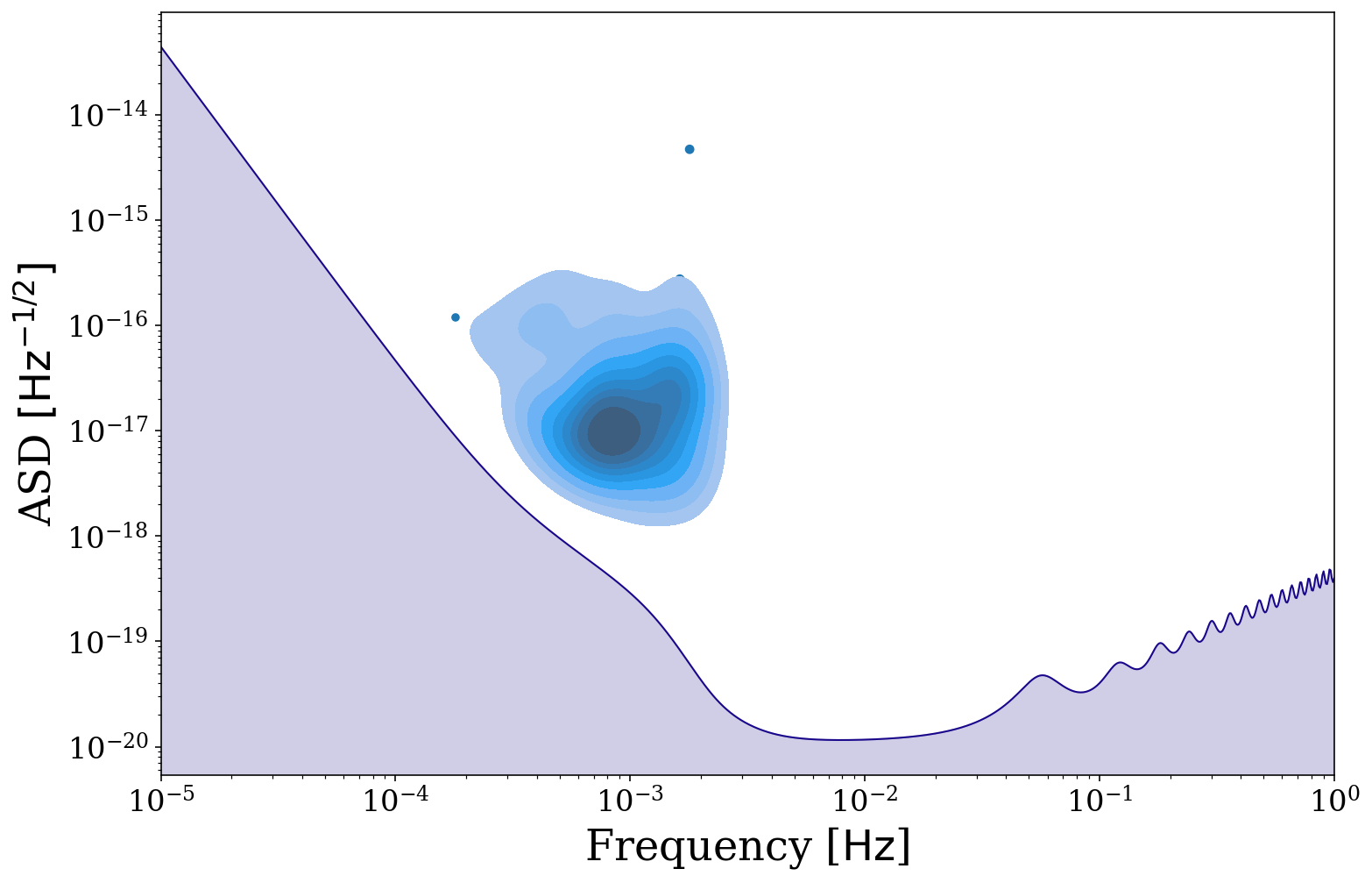
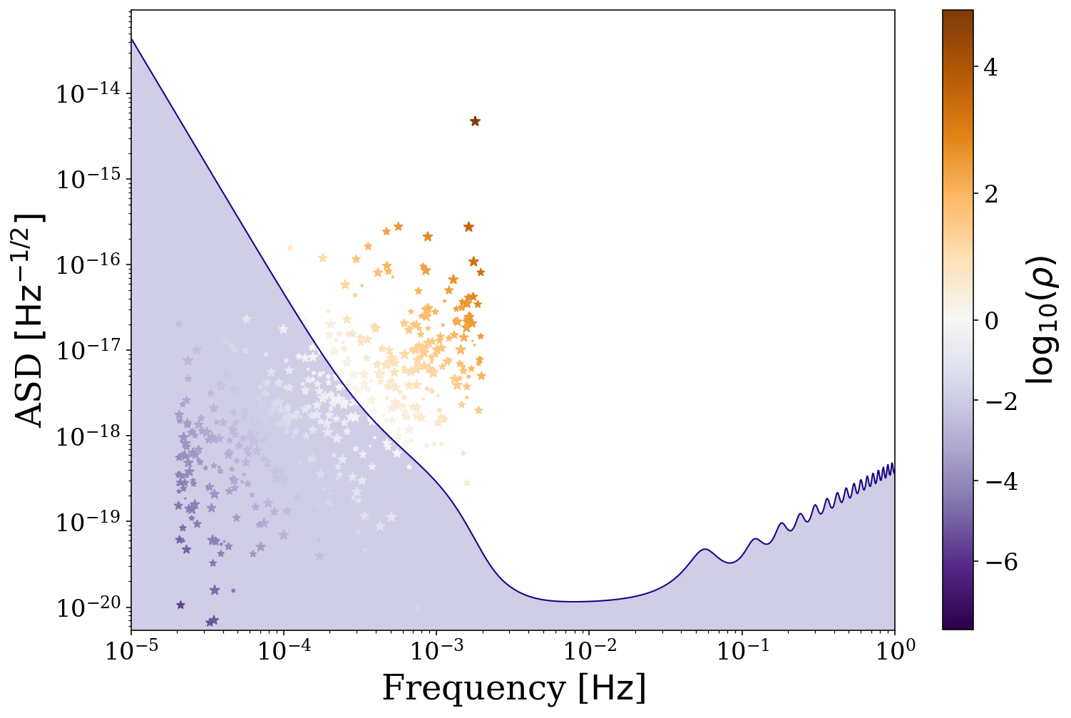
But we may not want to know about only the detectable population, why don’t we also plot the undetectable binaries. Additionally here we use a colormap to show the SNR of each binary and this map diverges at SNR = 1. Try changing the value of cutoff to see how the plot changes.
[30]:
# define the detectable parameters
cutoff = 0
detectable_snr = sources.snr[sources.snr > cutoff]
norm = TwoSlopeNorm(vmin=np.log10(np.min(detectable_snr)),
                    vcenter=0, vmax=np.log10(np.max(detectable_snr)))

fig, ax = sources.plot_sources_on_sc(snr_cutoff=cutoff, marker="*", cmap="PuOr_r",
                                     c=np.log10(detectable_snr), show=False, norm=norm, scatter_s=50)

# create a colorbar from the scatter points
cbar = fig.colorbar(ax.collections[1])
cbar.ax.set_ylabel(r"$\log_{10} (\rho)$")

plt.show()
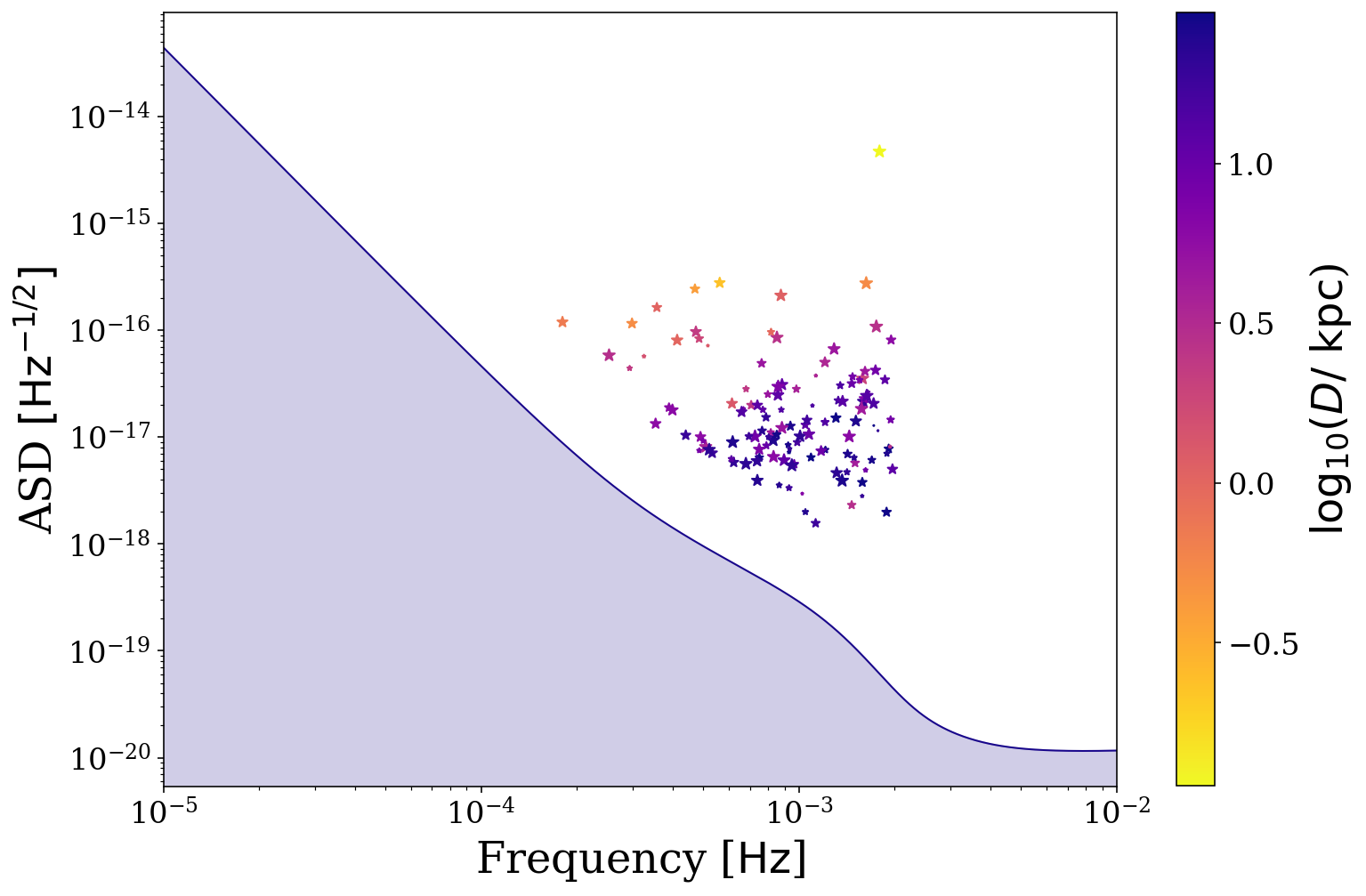
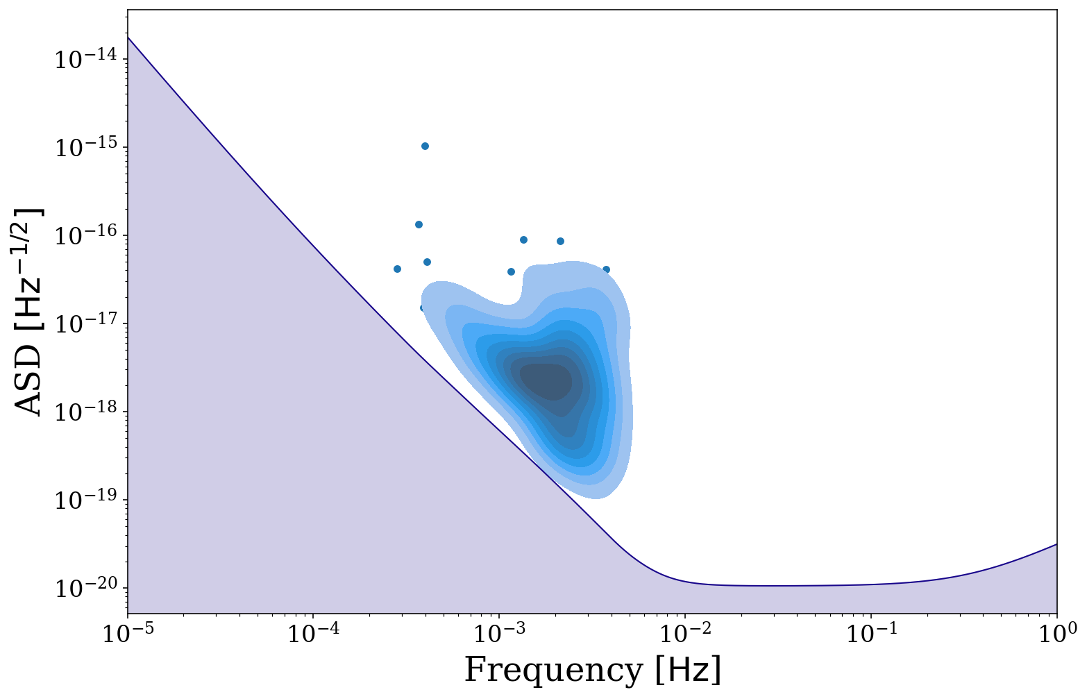
It could also be interesting to see how other parameters are affecting your distribution. Here is the same plot but with only the detectable binaries and coloured by their distance, as well as with a smaller x range. You should hopefully see that the more distant binaries are at higher frequencies and comparatively lower ASDs.
[31]:
# define the detectable parameters
cutoff = 7
detectable_dist = sources.dist[sources.snr > cutoff].value

# plot the detectable binaries
fig, ax = sources.plot_sources_on_sc(snr_cutoff=cutoff, marker="*", cmap="plasma_r",
                                     c=np.log10(detectable_dist),
                                     show=False, xlim=(1e-5, 1e-2), scatter_s=50)
# create a colorbar from the scatter points
cbar = fig.colorbar(ax.collections[1])
cbar.ax.set_ylabel(r"{}{:latex})".format("$\log_{{{10}}} (D /$ ", sources.dist.unit))

plt.show()
Eccentric and Stationary Binaries
These binaries work in much the same way as circular and stationary binaries. However, now the gravitational wave signal is spread over many harmonics. Therefore the harmonic with the maximum strain or snr may no longer be the \(n=2\) harmonic as with circular binaries. This is best shown in an example.
Let’s take a collection of eccentric and stationary sources and show how eccentricity affects the max strain harmonic.
[32]:
n_values = 500
m_1 = np.random.uniform(0, 10, n_values) * u.Msun
m_2 = np.random.uniform(0, 10, n_values) * u.Msun
dist = np.random.uniform(0, 30, n_values) * u.kpc
f_orb = 10**(np.random.uniform(-5, -3, n_values)) * u.Hz
ecc = np.random.uniform(0.35, 0.4, n_values)
t_obs = 4 * u.yr
[33]:
sources = source.Source(m_1=m_1, m_2=m_2, ecc=ecc, dist=dist, f_orb=f_orb, interpolate_g=False)
ecc_stat_snr = sources.get_snr(verbose=True)
Calculating SNR for 500 sources
        0 sources have already merged
        500 sources are stationary
                500 sources are stationary and eccentric
This source Class contains a function that returns the maximum strain harmonic for any given eccentricity.
[34]:
e_range = np.linspace(0, 0.995, 10000)
msh = sources.max_strain_harmonic(e_range)

fig = plt.figure(figsize=(15, 8))

plt.loglog(1 - e_range, msh)

plt.axhline(2, linestyle="dotted", color="grey")
plt.annotate(r"$n = 2$", xy=(5e-3, 2), va="bottom", fontsize=20, color="grey")

for e, l in [(0, r"$e=0.0$"), (0.3, r"$e=0.3$"), (0.9, r"$e=0.9$"), (0.99, r"$e=0.99$")]:
    plt.axvline(1 - e, linestyle="dotted", color="grey")
    plt.annotate(l, xy=(1 - e, np.max(msh)), rotation=90, ha="center", va="top",
                 fontsize=20, color="grey", bbox=dict(boxstyle="round", fc="white", ec="none"))

plt.annotate("More circular", xy=(1, 1e2), xytext=(2e-1, 1e2), fontsize=20, va="center", color="grey",
             arrowprops=dict(arrowstyle="-|>", fc="grey", ec="grey"))

plt.xlabel(r"$\log_{10}(1 - e)$")
plt.ylabel("Maximum Strain Harmonic")

plt.show()
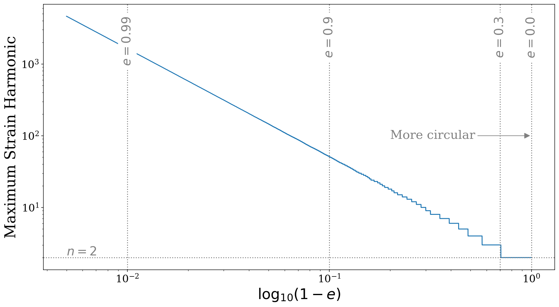
As you can see in the plot above, once the eccentricity is greater than approximately \(e = 0.3\), the maximum strain harmonic increases from \(n = 2\) to \(n = 3\) and this continues as eccentricity increases.
Although it is interesting to see this function, more directly applicable is the maximum SNR harmonic. This is useful because we should plot the binary at this harmonic instead of the \(n=2\). This harmonic is calculated for each binary automatically when the SNR is calculated and stored in self.max_snr_harmonic.
So now we can plot eccentric binaries on the sensitivity curve at their maximum snr harmonic, such that their height above the sensitivity curve is equal to their total SNR over all harmonics.
[35]:
fig, ax = sources.plot_sources_on_sc(snr_cutoff=7, show=False)
fig, ax = sources.plot_sources_on_sc(snr_cutoff=7, disttype="kde", color="tab:blue", thresh=0.1, fill=True,
                                     fig=fig, ax=ax)
We could also repeat this for a different detector like this
[36]:
# note that we can the interpolate parameters to TianQin defaults
sources_tq = source.Source(m_1=m_1, m_2=m_2, ecc=ecc, dist=dist, f_orb=f_orb,
                           sc_params={"instrument": "TianQin", "L": np.sqrt(3) * 1e5 * u.km, "t_obs": 5 * u.yr},
                           interpolate_g=False)
ecc_stat_snr_tq = sources_tq.get_snr(instrument="TianQin", verbose=True)
Calculating SNR for 500 sources
        0 sources have already merged
        500 sources are stationary
                500 sources are stationary and eccentric
[37]:
fig, ax = sources_tq.plot_sources_on_sc(snr_cutoff=7, show=False)
fig, ax = sources_tq.plot_sources_on_sc(snr_cutoff=7, disttype="kde", color="tab:blue", thresh=0.1, fill=True,
                                        fig=fig, ax=ax, show=True)
This concludes our tutorial for learning about the visualisation module of LEGWORK, be sure to check out our other tutorials to learn more about the exciting features that LEGWORK has to offer.