Note
This tutorial was generated from a Jupyter notebook that can be downloaded here. If you’d like to reproduce the results in the notebook, or make changes to the code, we recommend downloading this notebook and running it with Jupyter as certain cells (mostly those that change plot styles) are excluded from the tutorials.
Demo - Compare sensitivity curves
This demo shows how you can use LEGWORK to compare different detector sensitivitity curves. We illustrate these sensitivity curves as well as how the SNR of a source changes in different detectors.
[2]:
import legwork
import numpy as np
import astropy.units as u
import matplotlib.pyplot as plt
from matplotlib.colors import TwoSlopeNorm

from copy import copy
[3]:
%config InlineBackend.figure_format = 'retina'

plt.rc('font', family='serif')
plt.rcParams['text.usetex'] = False
fs = 24

# update various fontsizes to match
params = {'figure.figsize': (12, 8),
          'legend.fontsize': fs,
          'axes.labelsize': fs,
          'xtick.labelsize': 0.7 * fs,
          'ytick.labelsize': 0.7 * fs}
plt.rcParams.update(params)
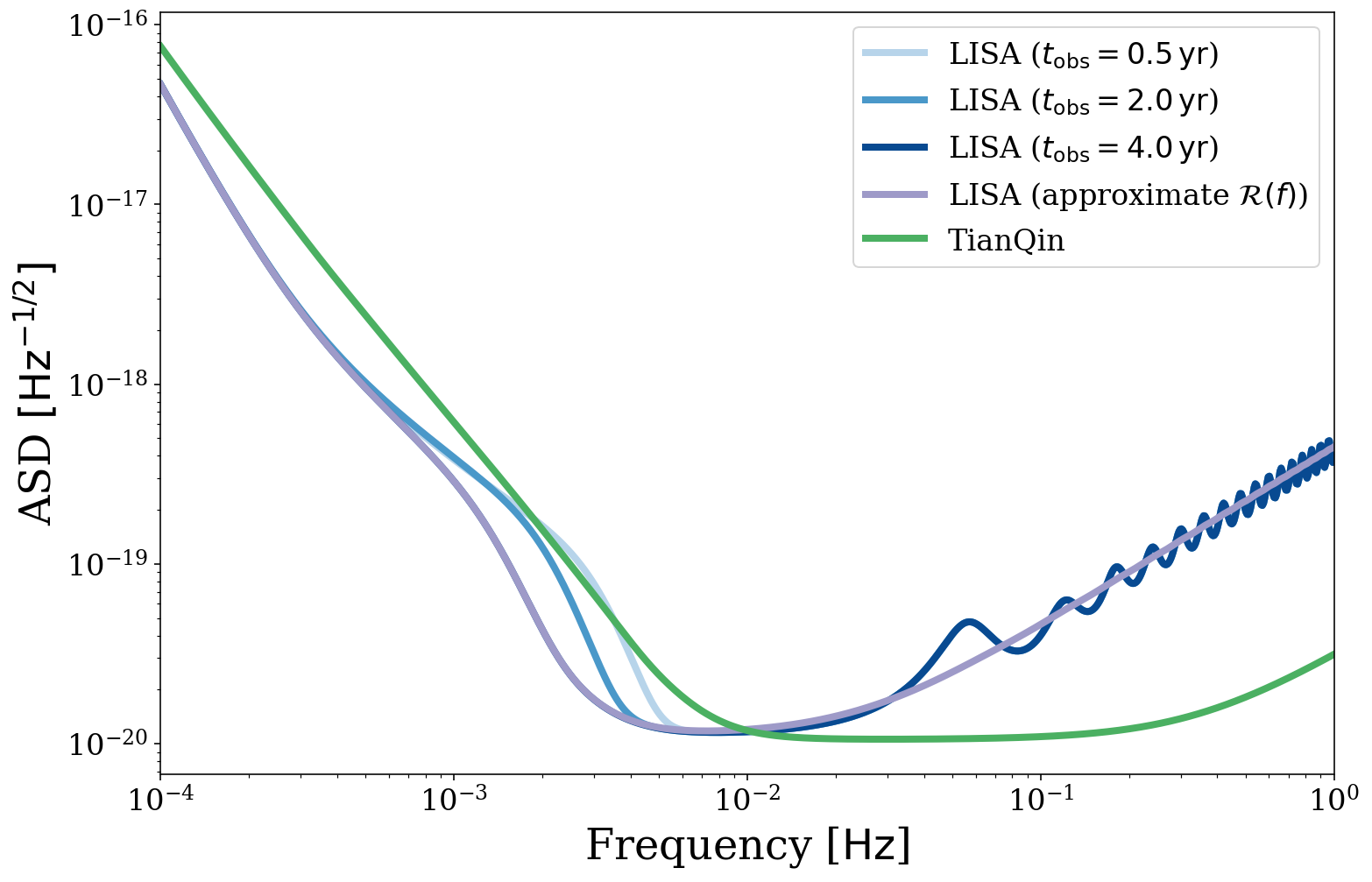
Direct sensitivity curve comparisons
First, we can plot the sensitivity curves directly to see which regimes are better for different detectors. Let’s look at different LISA specifications as well as the TianQin detector.
[4]:
# create new figure
fig, ax = plt.subplots()

# define the frequency range of interest
fr = np.logspace(-4, 0, 1000) * u.Hz

# plot a sensitivity curve for different mission lengths
linewidth = 4
for i, t_obs in enumerate([0.5, 2.0, 4.0]):
    legwork.visualisation.plot_sensitivity_curve(frequency_range=fr, t_obs=t_obs * u.yr,
                                                 fig=fig, ax=ax, show=False, fill=False, linewidth=linewidth,
                                                 color=plt.get_cmap("Blues")((i + 1) * 0.3),
                                                 label=r"LISA ($t_{{\rm obs}} = {{{}}} \, {{\rm yr}}$)".format(t_obs))

# plot the LISA curve with an approximate response function
legwork.visualisation.plot_sensitivity_curve(frequency_range=fr, approximate_R=True,
                                             fig=fig, ax=ax, show=False, fill=False, linewidth=linewidth,
                                             color=plt.get_cmap("Purples")(0.5),
                                             label=r"LISA (approximate $\mathcal{R}(f)$)")

# plot the TianQin curve
legwork.visualisation.plot_sensitivity_curve(frequency_range=fr, instrument="TianQin", label="TianQin",
                                             fig=fig, ax=ax, show=False, linewidth=linewidth,
                                             color=plt.get_cmap("Greens")(0.6), fill=False)

ax.legend(fontsize=0.7*fs)

plt.show()
SNR in different detectors
But we need not just look at the sensitivity curve, we could also investigate in what regimes of frequency and eccentricity each detector is superior. Let’s compare a LISA to TianQin with a grid of sources across eccentricity and frequency space.
[5]:
# spread out some frequencies and eccentricities
f_orb_s = np.logspace(-4, -1, 200) * u.Hz
ecc_s = np.linspace(0, 0.9, 150)

# turn them into a grid
F, E = np.meshgrid(f_orb_s, ecc_s)

# flatten the grid
F_flat, E_flat = F.flatten(), E.flatten()

# put all of the sources at the same distance with the same mass
m_1 = np.repeat(10, len(F_flat)) * u.Msun
m_2 = np.repeat(10, len(F_flat)) * u.Msun
dist = np.repeat(8, len(F_flat)) * u.kpc

# define a set of sources
sources = legwork.source.Source(m_1=m_1, m_2=m_2, f_orb=F_flat, ecc=E_flat, dist=dist, gw_lum_tol=1e-3)
sources.get_merger_time()
[5]:
[6]:
# compute the LISA SNR
LISA_snr = copy(sources.get_snr(verbose=True, which_sources=sources.t_merge > 0.1 * u.yr))
Calculating SNR for 26248 sources
        0 sources have already merged
        13486 sources are stationary
                222 sources are stationary and circular
                13264 sources are stationary and eccentric
        12762 sources are evolving
                158 sources are evolving and circular
                12604 sources are evolving and eccentric
[7]:
# compute the TianQin SNR
sources.update_sc_params({"instrument": "TianQin"})
TQ_snr = sources.get_snr(verbose=True, which_sources=sources.t_merge > 0.1 * u.yr)
Calculating SNR for 26248 sources
        0 sources have already merged
        13126 sources are stationary
                216 sources are stationary and circular
                12910 sources are stationary and eccentric
        13122 sources are evolving
                164 sources are evolving and circular
                12958 sources are evolving and eccentric
[10]:
# create a figure
fig, ax = plt.subplots(figsize=(14, 12))
ax.set_xscale("log")
ax.set_xlabel(r"Orbital Frequency, $f_{\rm orb} \, [{\rm Hz}]$")
ax.set_ylabel(r"Eccentricity, $e$")

ratio = np.zeros_like(LISA_snr)
ratio[LISA_snr > 0] = (LISA_snr[LISA_snr > 0] / TQ_snr[LISA_snr > 0])
ratio = ratio.reshape(F.shape)

# make contours of the ratio of SNR
ratio_cont = ax.contourf(F, E, ratio, cmap="PRGn_r",
                         norm=TwoSlopeNorm(vcenter=1.0, vmin=0.0, vmax=3.6), levels=20)

for c in ratio_cont.collections:
    c.set_edgecolor("face")

# add a line when the SNRs are equal
ax.contour(F, E, ratio, levels=[1.0], colors="grey", linewidths=2.0, linestyles="--")

# add a colourbar
cbar = fig.colorbar(ratio_cont, fraction=2/14, pad=0.02,
                    label=r"$\rho_{\rm LISA} / \rho_{\rm TianQin}$",
                    ticks=np.arange(0, 3.5 + 0.5, 0.5))

# annotate which regions suit each detector
ax.annotate("LISA stronger", xy=(0.1, 0.53), xycoords="axes fraction", fontsize=0.7 * fs,
            color=plt.get_cmap("PRGn_r")(1.0),
            bbox=dict(boxstyle="round", facecolor="white", edgecolor="white", alpha=0.5, pad=0.4))
ax.annotate("TianQin stronger", xy=(0.6, 0.73), xycoords="axes fraction", fontsize=0.7 * fs,
            color=plt.get_cmap("PRGn_r")(0.0),
            bbox=dict(boxstyle="round", facecolor="white", edgecolor="white", alpha=0.5, pad=0.4))

# annotate with source details
source_string = r"$m_1 = {{{}}} \, {{ \rm M_{{\odot}}}}$".format(m_1[0].value)
source_string += "\n"
source_string += r"$m_2 = {{{}}} \, {{ \rm M_{{\odot}}}}$".format(m_1[0].value)
source_string += "\n"
source_string += r"$D_L = {{{}}} \, {{ \rm kpc}}$".format(dist[0].value)
ax.annotate(source_string, xy=(0.98, 0.03), xycoords="axes fraction", ha="right", fontsize=0.75*fs,
            bbox=dict(boxstyle="round", facecolor="white", edgecolor="white", alpha=0.5, pad=0.4))

plt.show()
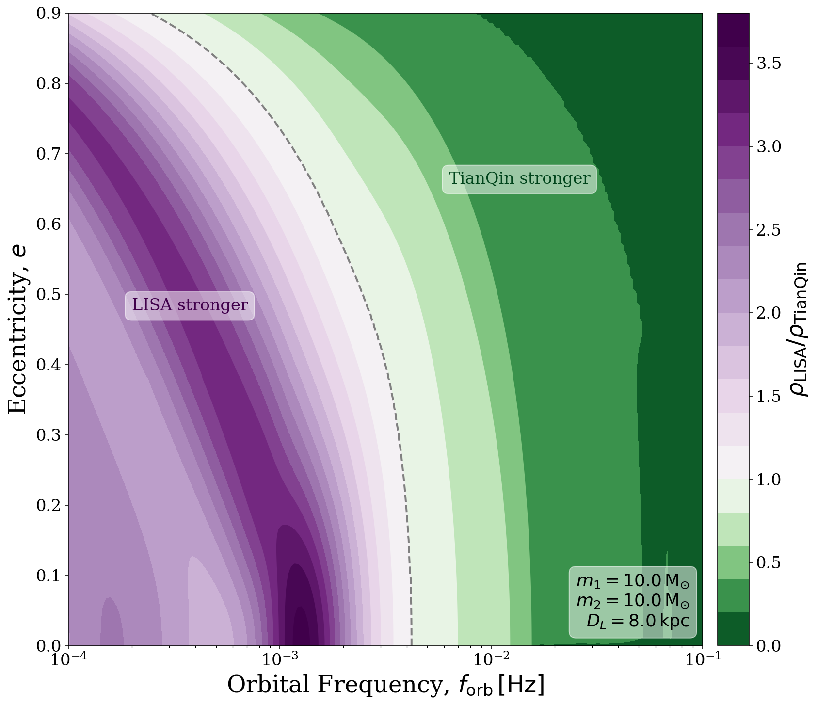
From this plot we can see that for circular sources at low frequenies LISA produces a stronger SNR. As eccentricity is increases, the range of frequencies at which LISA is superior decreases until at \(e = 0.9\), TianQin is better at every frequency greater than approximately 0.3mHz!